Thursday 30 June 2011

Historical Postcards Part 2 - Manchester, Salford, and Ramsbottom.

No18 Postcards, a dying art...

Reflective Journal Entry No18 30/06/11

As mentioned briefly in Journal entry No17, I watched the item on BBC Breakfast News this morning, and really quite annoyed with myself that I didn't record the item. I don't actually know what prompted this report and the interview with both the people in the studio, but it centred on the fact that we the British Public, just don't communicate as often anymore by Postcard, except for when we are visiting a place of interest, for the day, or on holiday as Tourists.

It is just another example of the way a craft, and art and a form of communication and the pace of life, has slowly come to the point where it has nearly died out. Watching and listening to the discussion raised a few points.

1. The postal service, in the discussion it raised the point that over 100 years ago, post was delivered up to 6 times a day.

2. The development of the Telephone, meant the public relied less on written messages for short-term communication.

3. The form of images/illustration changed during the 1st World War, and the art never really recovered after this. 

The posting before this showed a few examples of some of the earliest postcards sent, also the styles of writing show again the difference in where communications have gone in the last 120 years especially.

This method or craft, has once again brought back potential for visual exploration of the medium, and may off a way to further include an option of cards to be included in the resource kit of materials? I will detail this over the next few days, and should have by the weekend additional photography of the Rylands interior...


Historical Postcard examples Part1...

No17 Postcards...

Reflective Journal Entry No17 30/06/11

This morning by chance, I was watching the Breakfast News on BBC1, when they broadcast and item on why we don't seem to communicate with postcards anymore? I thought well this could certainly feed into my current work, so I will explore this further later...

Wednesday 29 June 2011

No16 Thoughts post MA group discussion 28/06/11

Reflective Journal Entry No16 29/06/11

It is still early days in the exploration process for the last project work on the MACD, and in recent weeks since the last meet, I have been researching quite extensively the personal archive especially my own archive, how I trained, the leading lights of the day, designers who influenced me and provided very direct contact in and guidance. The real coup in the last week has been the contact with the Rylands and the chance to research their extensive collection of manuscripts, this set against the background of actually undertaking a series of experiments has boosted my confidence and I was able to provide this information to yesterdays group meet.

Development will continue with the historical archive exploration and I have contacted Julianne Simpson curator of this collection this morning, to set up a visit in the coming weeks. In the meantime I'm putting together further creative development of the AV slideshow, as begun in the 2nd Semester, and this is continuing. I have also before I forget now created the 'twin image display' which I had struggled to create conventionally last time, with the 'twin projector development'. This week using iMovie I successfully blended to the footage of the 'sky time footage' this is my 'moving timeline', with the images visuals and 'colour palette coding' and have now added Rylands Library visuals and my own handwritten examples. It is from here that I will develop the typographic element of handwritten script and interacting with the Rylands collection.

For the report the underlying them will focus on the way digital technology has over the last 20 years in particular seen the decline of the handwritten script, and the effect of modern communications on how individuals communicate with each other, and by this I mean a portion of the population under 25 who no longer write letters anymore?

It is with a sense of irony that while writing this latest entry, I was sent a link by e-mail which announced that 'Design Week' one of the creative industries foremost printed publications, is to cease printed version of it's output, and will instead concentrate on an 'online version' only. It was in many ways only a matter of time, and also I believe heralds how the future of publishing is going.


More to follow on this...


Monday 27 June 2011

Rylands reference photographs...

No16 More handwritten thoughts Part2

Reflective Journal Entry No16 27/06/11

Second selection of images of my own handwritten notes, thinking about using these for final pieces...

No15 More handwritten thoughts on current idea strands... Part1

Reflective Journal Entry No15 27/06/11

As mentioned briefly in No14, still continuing to develop the route for Typography and the Handwritten styles and here are my latest sketchbook thoughts enhanced, as originally submitted in my 1st semester sketchbook, this will now be continued... The next selection will be pics which may be selected for the AV Slideshow?...

Friday 24 June 2011

No14 More thoughts on current idea strands...

Reflective Journal Entry No14 24/06/11

Still continuing to develop the route for Typography and the Handwritten styles. I'm coming to the conclusion the more I explore this area, the more, I feel like a 'Designer/Artist out of time'. Don't get me wrong I have once again fully embraced the expanded digital age we now live in and also take very much for granted, as I did back in 85 when I first undertook my initial computer graphics training, had I not got on board, then like so many of my generation of Graphic Designers form that period, I would have very quickly in a few years have struggled to stay in the business at an only conventional level. 

It was quite simply train, move on and develop, or just disappear into oblivion!

More to follow tomorrow...

Thursday 23 June 2011

No13 Meeting today at The Rylands Library P1...

Reflective Journal Entry No13 23/06/11

Quick note to post a few thoughts on my meeting today with Yvette Jeal from the Rylands. The meeting went very well very positive, and I got the opportunity to present my current work, and the video footage I shot on Tuesday. I will post tomorrow again with more details on this meeting, but for now I have been given permission to undertake a series of visual experiments in the next month, I just need to work out my dates (it may need 2 visits but 1 may do it?) and there areas I would like to choose. In the next week I shall drop Yvette a line back with timing and areas of interest, and I shall also be undertaking another fact finding visit...

I have also adapted my AV Slideshow, making alterations in content and some of the running order, especially the inclusion of more JRL shots.

The link below,


I will be delving into this further next week on my next visit and hopefully arranging a viewing of the materials?

More to follow tomorrow...

Wednesday 22 June 2011

No12 Additional thoughts on typographic history and iMovie editing progress made today P1...

Reflective Journal Entry No12 22/06/11

Delving back into the archive's once again, this time to explore more typographic history. On Monday 20th I had a very good meeting with Tash my MACD tutor to discuss direction on the part of my ongoing project. I have been given the green light to continue my typographic exploration coupled with my analysis of personal and other handwritten styles, plus taking further my projection project which will now incorporate the typographic element more strongly and using the Rylands Library inside as the backdrop (meeting set for tomorrow at 2.00p, there)

More to follow later...

Updating later, I have made progress on the multi-image editing front using 'iMovie' For a a few weeks I have been trying to work through how I could apply a 2nd image to the rolling AV slideshow I created, and which has been projected on the main screen in the 109 Lecture Theatre. I undertook further tests yesterday some of which were successful others were not, however I did manage to achieve a collection of rough takes, which can be montaged together, but I now believe that to do this I will need to look at Adobe After Effects, and for this I have this afternoon downloaded a trial copy and will make a start on looking through tutorials tomorrow. In the meantime I have at least reached a point of real progress with the multi-imaging in iMovie and I will create another option for this, ready for another test, but this time in the Rylands itself.

Tomorrow I shall be working through my hand written notes to start to create a number of hand crafted examples based on my own personal journals, to start the process. I'm considering asking a good friends of mine in the states (she is a published poet) if I may use one or two of her poems to act a the basis for my handwritten examples which will them be blown up to a much larger size. As yet I'm not thinking the final thing, but there are still at two items I want to have printed and these will need updating first, timeframe no more than 3 weeks, this will run in the background.

Sunday 19 June 2011

No11 Additional thoughts on where to go next Part 4... Letraset

Reflective Journal Entry No11 19/06/11

Once again delving back into the archive's and my personal archive experience, as I mentioned earlier while I was recently searching through some of my old college work, I came across photocopies from an old Letraset catalogue from 1978, in fact my first contact with Letraset was in 77, just after I had started college, and a rep from the company was visiting the college to promote products to the 3rd and 4th year Graphic students. I had just by chance had a tutorial with Tony, and he got a call that the rep had arrived, and he said 'fella here's a chance to make a start, and also you will get a few freebies in the process'. Tony wasn't wrong I received a small pack of type transfers and paper, plus a couple of marker pens, not bad for a 1st year fresher, the others were stunned.

This proved to be a pivotal moment for me, as before this I was not aware of the company and it's products and after this I was determined to get to know all their products, also by chance in early 78, my Father was given a couple of copies of the new catalogue (he sold photocopiers to design and advertising clients in Manchester) and I was able to have a selection of copies from these to use for my college work reference.

Tony designed fonts, which were featured in the book, and also knew many of the type designers of the day who also had work in the book, and even the Creative Director, Phil Grimshaw. Other contemporaries of the day were Trevor Johnson, Lionel Hatch and Ben Casey, these were the icons of the day from Manchester for me and the kind of design environment my work grew up in, in addition to David Hillman and Saul Bass and Herb Lubalin, in fact the type poster of Lubalin's featured in the previous post closely resembles the poster which was on the wall above me in the studio at college for the next 3 years, next to this was Tony's own multiple font poster and the work of Phil Grimshaw.

The main thing for me looking back on this now was how at the time I took all this for granted. A large part of the way my work developed, my design style, my appreciation of the hand drawn font form, still sits within my current practice today. Letraset were the masters of the day, if you needed any dry transfer, whether it be type, images, tones, colours or markers, and spray systems, there were the leaders, long before Apple technology and long before Adobe, it was hand crafted, it was conventional and it was a skill you had to train for.

Archive College ref: Letraset catalogues...

For a young student designer in the late 70's this was the bible for commercial type. I still have somewhere a catalogue from 1996, and a photocopied selection of fonts, I had to research for a type project with Tony Forster, as I couldn't afford to buy one (well not until 1981 when I got misprinted copy cheap) now there's a thought I wonder what ever happened to that?

Herb Lubalin type...

No10 Additional thoughts on where to go next Part 4... Herb Lubalin, Left handed typographer...

Reflective Journal Entry No10 19/06/11

Delving back into the archive's and my personal archive experience, while I was recently searching through some of my old college work, I came across photocopies from an old Letraset catalogue from 1978, where I had photocopied examples of fonts and those of Herb Lubalin, as part of my early typographic research for one of Tony Forster's type classes. I have only just discovered that Lubalin was in fact 'left handed' a fact I was not aware of at the time. I do remember having a lengthy discussion and practice session with Tony to practice using both hands to draw characters just to see the difference the sweep of curves and cursives, and the slightly unusual quality that being left handed gives when writing and drawing with a large brush.

Lubalins work can be found on the links contained within this latest journal posting.

Herb Lubalin font examples...

Friday 17 June 2011

No9 Additional thoughts on where to go next Part 3... The John Rylands Library

Reflective Journal Entry No9 17/06/11

Significant progress has been made over the last 48 hours. On Wednesday while in town I dropped by the Rylands Library to do some research for my current route of development on the 'handwritten word' and by chance I got into conversation with one of the staff, and from this has now led me to being able to set up a meeting with the Building Manager Yvette Jeal, next Thursday 23/06 where I will be able to present the proposal, I originally wanted to present pre-Easter to MOSI. I shall be presenting a selection of the materials I have already created during Semester 2, after this we will be walking the building to look at potential areas where I can project the images and also film them.

Ironically I have already taken a selection of photographs from with the Rylands to use in the AV slideshow presentation which I will add to as this is now going to develop in a slightly different form, this time there will be a strong typographic connection and projected images will also have my own handwriting included. This development has given me a much needed boost in confidence on a few things which are currently happening for my Wife and I at a crucial time.

http://www.library.manchester.ac.uk/

Thursday 16 June 2011

Pantone 100 postcards...

Finally just received this via Amazon, mind you I ordered this back in February and when it arrived yesterday the outer box was buckled and marked, however they have sent a replacement, but be careful the outer packaging is not really that strong. Still a good addition to my reference collection...

Wednesday 15 June 2011

No8 M/cr bombing 15 years today and additional thoughts on where to go next Part 2...

Reflective Journal Entry No8 15/06/11

Well the day came around today where we finally reached the 15th anniversary of the Manchester Bombing in 96. For me it was a day of disappointment, after getting the positive feedback around October last year from The Royal Exchange and talk about putting together a small display of my graphic materials acknowledging the event in the RET, the timing and the recovery, the whole process dwindled into nothing, and nothing actually came off in the end, which pretty much summed up the 1st semester submission, lots of promise, lots of talk, lots of excitement about potential, speaking to various people connected with the day, the events, and the post bomb transformation of the City Centre, all to no avail in the end, and again at the end of Semester 2.

However today there is a renewed feeling of optimism following discussion with the current project work, in between the 2nd semester delivery and now the beginning of the 3rd semester. Yesterday and now today I have had 2 very encouraging conversations with the management at The John Rylands library in town, and this could provide the opportunity to finally sort out the materials for the AV Slideshow? I shall be undertaking another Lecture Theatre test at Centenary next Tuesday morning, 2 options with and without soundtrack, and also now including some items of my handwriting, as I really want to expand this project into using my own typography, my own handwritten examples.

It was certainly mentioned in the last Semester, that the tests in the 109 were only rough drafts or rough cuts, well this if fine, but for me the term rough cut means that this leads to a finished presentation and it here that I will be aiming to conclude the project with the additions as laid out now in my sketchbook in previous posts.

Finally today I also joined The Typographic Circle, thought it was time I should to expand further my network of contacts and looking at potential show options in London later in the Autumn.

Latest scribbles Part 2...

Latest scribbles Part 1...

Tuesday 14 June 2011

No7 Additional thoughts on where to go next with this project... and Christchurch.

Reflective Journal Entry No7 14/06/11

Today proved to be a day where there is the potential to revisit a couple of areas of creative archive, and to explore archive materials. There has been a theme although not immediately obvious to the general onlooker at first, which is running through the creative background of my work on the MA Core Project work. It is with a certain degree of irony that back in September last year 2010, I proposed a 'cross geographic platform' as an education resource for both Manchester and Christchurch in New Zealand. Manchester because of the bombing of 15/06/96, and this anniversary will be upon tomorrow, and Christchurch because of the Earthquake of that month, and since again with far more tragic consequences, the loss of 181 people, and now again at the beginning of this week 13/06/11 where further quakes have once again caused damage and injury. The plight of the people of CHCH is very much once again on my mind as we have both Family and friends there, many of whom have lost nearly everything, it is a sobering thought...

My original aim was to create a 'resource kit of materials' which act a guiding point for CHCH, and show how a city can survive through a significant event, in Manchester's case it was the 'air raid bombing during the early part of World War II', and the 'IRA bomb of the 15th June 1996', in the case of the war damage it took the city over 25 years to really get to grips properly with the regeneration, this is really not a well known fact, because for many it is taken largely for granted.

I have throughout the work so far explored a personal archive of influence, to show how the city has changed once again and still continues to change year by year. I appreciate that there is a guidance from the teaching team, to see a different approach and direction, but for me both semesters so far have been connected and this final semester will also have a connection, however it will be connected more by an installation delivery mechanism, than visual idea?

I'm going to pursue this area of handwritten script, to introduce my own writing style and typography, by keeping this more focused and also in a tighter delivery, I should be able to realise my eventual outcome and deliver a completed package of materials... It has been frustrating so far not to have properly completed to my personal and professional satisfaction one of the last components, this being the AV Slideshow presentation, this is where I shall be moving ahead on, to use this as a vehicle for the typography area I want to explore. In addition my goal of having a projected installation at a chosen venue, could once again be very much on the cards, after the bitter disappointment of being fobbed off by a couple of well known organisations, I hope to soon have better news to post on this, as this part of my project is still for me an area I want to explore further and complete.

Monday 13 June 2011

No6 The Death of the Handwritten Script?...

Reflective Journal Entry No6 13/06/11

http://ilovetypography.com/2007/10/22/so-you-want-to-create-a-font-part-1/

I have been giving more thought to the hand crafted script of my handwriting, and will thinking about this wondered if there could be explored both a left and right handed version? In the last few years I have become increasingly interested in the development of left handed tools, implements and pens, having spent my early school years in Manchester resisting the pressure from my teachers to write 'right hand only', I just took for granted that I would just get used to right only equipment, to such a level of use, that even now using a left handed scissors feels strange to use.

This line of exploration is in its early days and not sure if this will be fully developed in the coming weeks. I do hope that it will form some part of the final educational resource of materials? Again not sure if this is going to fully explored to the level I wished back in September, but the aim is to pull together all the finished components of 1st and 2nd Semester materials and have them play a part in the 'proposed resource kit'.

The link included in this latest entry outlines how you can create a font from your own handwriting, this is one of the ideas which has been running around my mind for the last couple of years. Yes it is mainly digital in after conventional creation, but this serves up a platform from which I will draw upon to create larger installation pieces either for a final piece or as part of an ongoing practice?


No5 The Death of the Handwritten Script?...

Reflective Journal Entry No5 13/06/11

As stated in No4, I want to challenge myself with this chosen subject and I feel that there is a very real area here to explore. Modern digital technology has brought about some significant changes in the last 5 years alone, and I would certainly be a false statement, 'if I said this for me was very much a welcome thing', especially as my Professional practice both teaching and direct client work has benefitted enormously over the last 10 years alone. This morning I have been working through thoughts sketching out ideas, studying through a practical exercise how my own handwriting looks over scale and using different pens, these examples will be posted next after I have photographed them.

What this exercise proves to me, is that I don't have one defined style to create this family of fonts I want to create. Tony my tutor at college said to me very early on, 'that many factors shape the way we write, how we hold the pen, how we were influenced in learning to write and the type of pen, brush or even quill we use'. He also made an interesting comment that because I'm also 'left handed' I immediately rotate the implement I'm using differently. For many years I was never really able to use a right handed fountain pen, why I hear you say? Well it's down to the nib and how it's machined, because I'm using the nib against its grain it will tear the paper I'm writing on, which is why the nib has to be machined in the opposite direction.

This link shows a number of examples of how left handed people hold the pens.


A quote from this site states,

While there is a common perception that fountain pens are problematic for left-handers, the truth is that lefties love fountain pens. In fact, left-handers tend to own fountain pens at a higher rate than their percentage of the population might otherwise indicate...

Saturday 11 June 2011

No4 The Death of the Handwritten Script?...

Reflective Journal Entry No4 11/06/11

I want to challenge myself with this chosen subject, but at the same time I'm also conscious of not leaving myself short on time again. There is clearly a lot of ground to cover in this chosen area of research, an area which for a number of years I have thought about, but never really got into in any depth. I have from time to time started to think about the subject and the resulting craft skills, and it was after once again after delivery of a presentation to my HND students on Tony Forster that I now feel that the time is right to explore this area.

Later I will return to this subject...

More historical supportive refs...

A selection of web links to further develop the historical content for background research.

http://www.thinkingwithtype.com/

http://thecaseandpoint.com/2011/04/doyald-young-poster/

http://vimeo.com/12733075

http://www.society6.com/studio/lishoffs/ABC_Superheroes

http://www.nytimes.com/2011/04/04/arts/04iht-design04.html?_r=4&src=recg%3Fsrc%3DISMR_HP_LI_LST_FB

http://museum.antwerpen.be/plantin_moretus/index_eng.html

http://www.linotype.com/414/claudegaramond.html

Friday 10 June 2011

Historical archive link for handwriting...

http://www.fontsource.com/handwriting.htm

http://www.amazon.com/Introduction-Manuscript-Studies-Raymond-Clemens/dp/0801487080/ref=pd_sim_b_1

http://www.fontsource.com/aboutfonts.htm

Initial research route for both Fonts and Handwriting, both of these give a brief overview of how the processes of both developed. These will now feed into the beginnings of the biblio I will need to get underway for the dissertation.

Thursday 9 June 2011

No3 The Death of the Handwritten Script?...

Reflective Journal Entry No3 09/06/11

As with most skills these days, it is the craft of writing by your own hand, which is now being seriously undermined by 'modern technology'. While the advance in digital technology is in the main a good thing, I believe that it has also allowed a high degree of complacency and in some cases lazyness to creep into contemporary communications. It was certainly very different for me as child when from the age of nearly 5 I was encouraged to practice, practice and still practice my handwriting, and when I mentioned this fact it is viewed with a sense of bewilderment by a younger generation, who's ease with the modern digital technologies in most cases they just ask 'why?'

I do find that over the last 15 years in particular, both from my own Professional Practice in it's latter stages and into my first foray into Teaching, the loss of basic skills, writing a handwritten letter, even signing their own signatures and basic note taking, appears to be beyond generations below the age of 25? I found it deeply worrying when I would be looking at young designers or graduates CV's and letters of application who had applied for the advertised position, just how many who could not write a 'both upper and lower case' many with just joined up caps, these would not be on the candidate list.

As I said this is a personal view and some might say this is wrong? Well lets debate this, get a discussion going put the topic out there and see what people think?

For this latest aspect of my blog I want to test this out and these 'Reflective Journal' entries are now part of this process, and will feed directly into my dissertation.

No2. The Death of the Handwritten Script?...

Reflective Journal Entry No2 07/06/11

What do we mean by 'the death of handwritten script?

It is really not surprising that a point in time would be reached in our human evolution, where we would no longer write in the classical sense, letters, the 'documents of legality'. When you look back over the last 1000 years of evolution, there are those significant periods in time were advances in communications were made. A large part of this was the control of the information to the masses. Acknowledging this control  which was primarily down to the church and then government but the church firstly, In Britain for many centuries the church controlled the level of information given to the population, a fair percentage of whom could not read or write ,and it was down to the appointed scribes of the day to record all dealings with Church and State, events including punishments.

I have delivered lectures on, The Gutenberg Bible, Caxton, Garamond, early Letterpress, and the beginnings of the modern newspaper and quite uniquely who this all relates to Manchester and it's position in the world of communications and publishing. I will explore these background details to support my Typographic direction in the coming Journal entries.

Recently through my Teaching Practice on the HND Graphics course, I taught the Image Making Module. This module was split into 2 parts, the first area being Photomontage and the second was dedicated to Historical Headline Typography, take from this brief was the following information I had researched and put together to give the students the historical timeline they needed to research.

Example as follows:

As a way of helping you with the periods of time, I have detailed below, the specific groups from the last 10,000, I have broken them down and set them into specific groups. In addition I have included a number of extra notes, in particular post 1950's where the beginnings of Pop Music became the popular culture and started to influence art and the media of the day. The first group deals in 2 parts the different ages of man, leading up to the Roman Empire. The second shows the post fall of Rome into what became known as the Dark Ages, and then moves forward to the Industrial Revolution and the Edwardian period. Taking us up to the 1920's. I have not gone into too much detail on these early periods, as I will also give you an additional handout showing periods and influential artists. This handout covers more in-depth the modern periods (Post 1950's) and major influences of the day.

Group 1.

Stone Age (Paleolithic/ Neolithic) Iron Age, Ice Age, Bronze Age, Copper Age, Egyptian, Ming Dynasty, Mesopotamia, Mayan, Aztec, Ancient Greece, Ancient Rome.

Group 2.

Dark Ages, Middle Ages, Renaissance, Elizabethan, Tudor & Stuart, Restoration, Napoleonic, Georgian, Victorian, Industrial Revolution, Edwardian.

The last group, shows from the 1920's onwards to the present day. The style or trend at the moment and certainly for the last 5 years has, most definitely been retro, the arguments for and against this are many, and really don't form part of this exercise, however this exploration of the last 45 years, from the Beatles onwards, has seen significant developments in design trends and look.

The last big movement in design and music trend was the Punk Movement of the late 70's, prior 1976/77 the 70's had suffered a jaded 60's hangover, with glam being the fashion of the day. In 1976 this all changed. The Sex Pistols, Neville Brody, The Clash, Peter Saville, Joy Division, The Buzzcocks, Factory Records, Iggy Pop, to name but a few, spearheaded a new look and sound. Design changed almost overnight. This then led into the more marketing orientated style of the 80's and really the whole of the 80's became the modern basis for todays' style and thinking and marketing. The selections are not complete and are only for a guide!

Group 3

1920's/1930's (Cubism, Picasso, Dali, Bauhaus, Mondrian, Van Doesburg, Esher)

1940's/1950's (Elvis Presley, The Worlds Fair, Pollock, First Man in Space, WW2, Post War Britain, Neo-Liberty, Neo-Classicalism, Rationalism)

1960's/1970's (Beatles, Pop Art, Warhol, Philip Castle, Michael English, Hockney, David Bailey, Pink Floyd, Led Zeppelin, Vivienne Westwood, Psychedelia, Roger Dean, Woodstock, 1st Man on the Moon, David Bowie, Jimi Hendrix, Punk Movement, Sex Pistols, Apple Mac)

1980's/1990's (Neville Brody, New Romantics, Michael Peters, MTV, Live Aid, Wally Olins, Terence Conran, Mobile Phone, Liverpool, Richard Branson (Virgin Group) Manchester, U2, Émigré, Apple iMac, Hip Hop, Indie, Drum n' Base,)

2000 + (Wireless Internet, ipod, itunes, Global Warming, Recycling, The Environment, Tate Modern, Muse, Green Day, The Killers, Ibiza, Damien Hirst, Banksy, Social Networking)

Peter Godkin 2011

***The main purpose of this exercise was for the students to establish a time and period direction.


Tuesday 7 June 2011

Historical examples No3...

Historical examples No2...

Historical type poster example...


This was the poster example given to the students as part of the handout...

Hot Metal Type...

No1. The Death of the Handwritten Script?...

Reflective Journal Entry No1 07/06/11

What do we mean by craft?

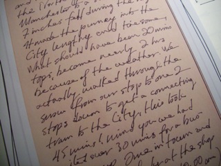
This is question which is being repeatedly asked in recent years and also current debate in the creative industries, as it is perceived that we have become over run with 'Digital Technology' to such a degree that many people under the age of 25 no longer know how to handwrite, or have developed their own handwriting?

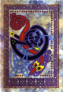
It is a troubling question especially in education, as this also impacts on the the level of employability students and the general public have when trying to make their way in the world. I started out with a very simple and straightforward proposal to rediscover the true craft of typography, an in this I mean taking the story back to beyond letterpress and the first printed word (Gutenberg Bible, Caxton, Garamond) to the 'Book of Kells'

Typography is my specialist area and for a while now I have wanted to dedicate a project to look at the 'non Digital Design' and how to create a font or family of fonts for this purpose, and in looking at this more closely through discussion to raise the question of the handwritten form, differing styles differing languages, will be a route to explore. I do though want to create my own style and interpretation but to keep this aspect of the work sharply focused in typography.

3rd semester New direction and it's all about Typography...